Graphic design
Sidu! Det svenska i Finland
I designed the logo, the visual identity and the presentation templates for an open online course that teaches Swedish.
Project summary
- Client
- Aalto University and the University of Helsinki, the Kielibuusti project
- Year
- 2022–2024
- Type
- Visual identity, print, animation
- Tools
- Adobe Illustrator and InDesign
Background
Sidu! is an open online course teaching Swedish to foreigners living in Finland. It covers Finland-Swedish history, society and culture, and tells the stories of people who have learned Swedish and settled in Finland. Places and Finland-Swedish regions are central to the course content, which made them a natural starting point for the identity too.
Design
Sketching a playful logo
The identity had to be playful and approachable, because the course is open to everyone and is many people’s first contact with the language. I sketched dozens of versions of the logo and presented four of them to the client.
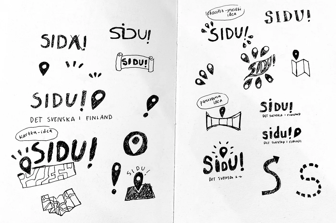
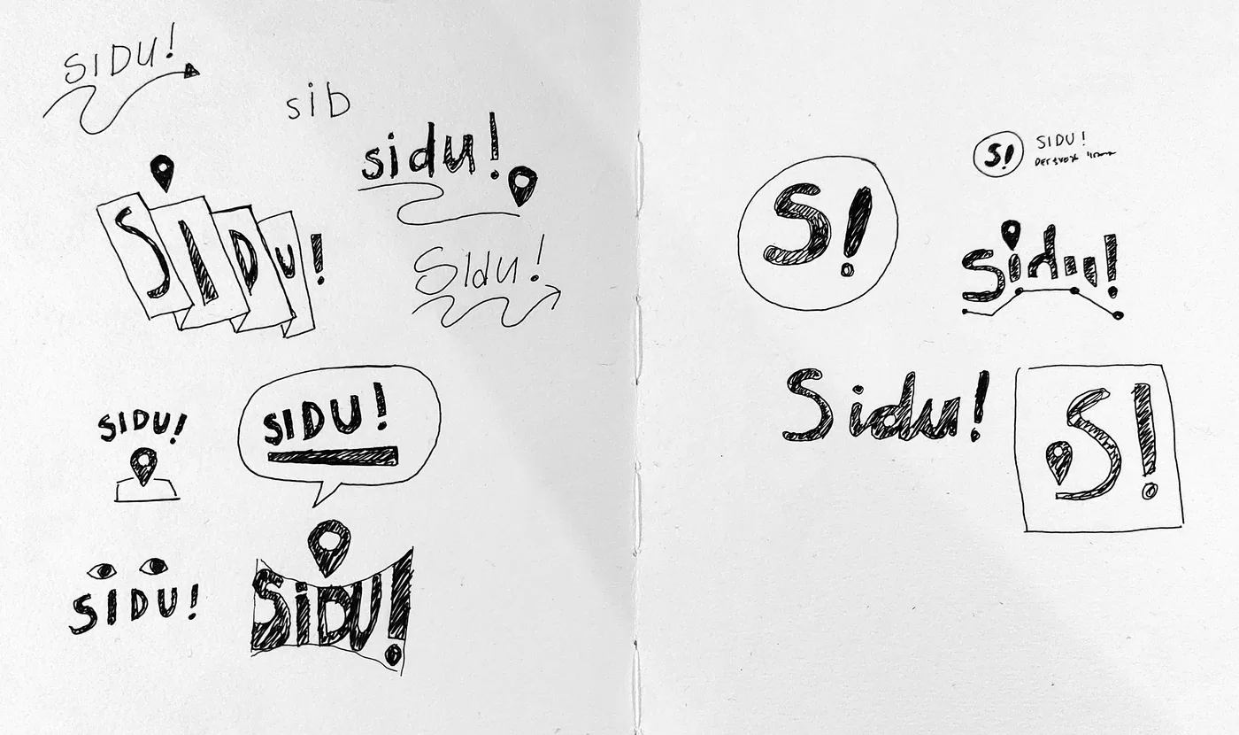
The first sketches. The map pin was already recurring in several directions at this early stage.
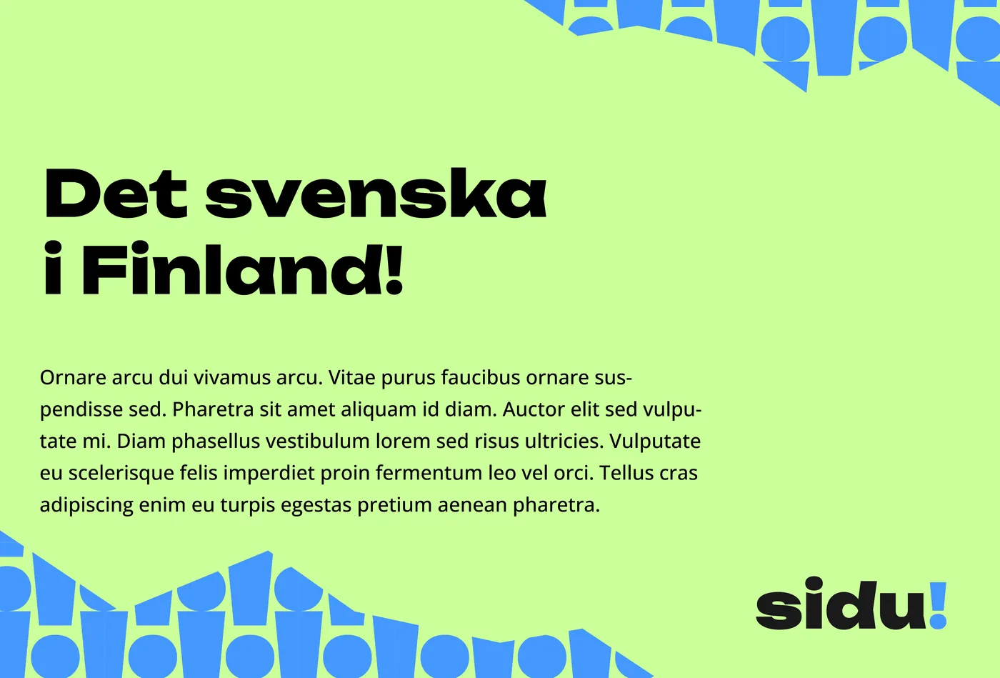
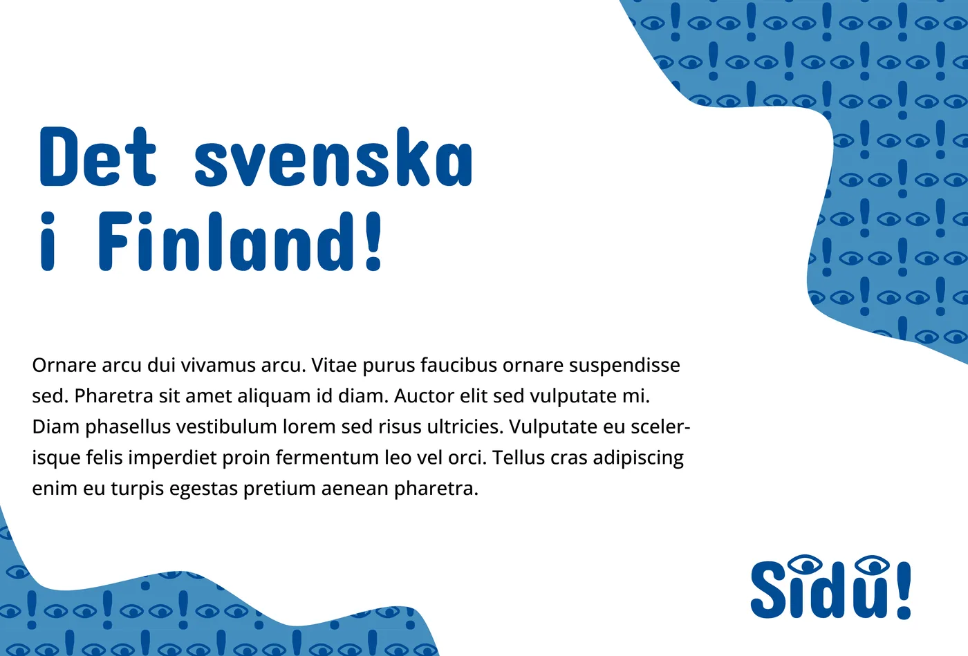
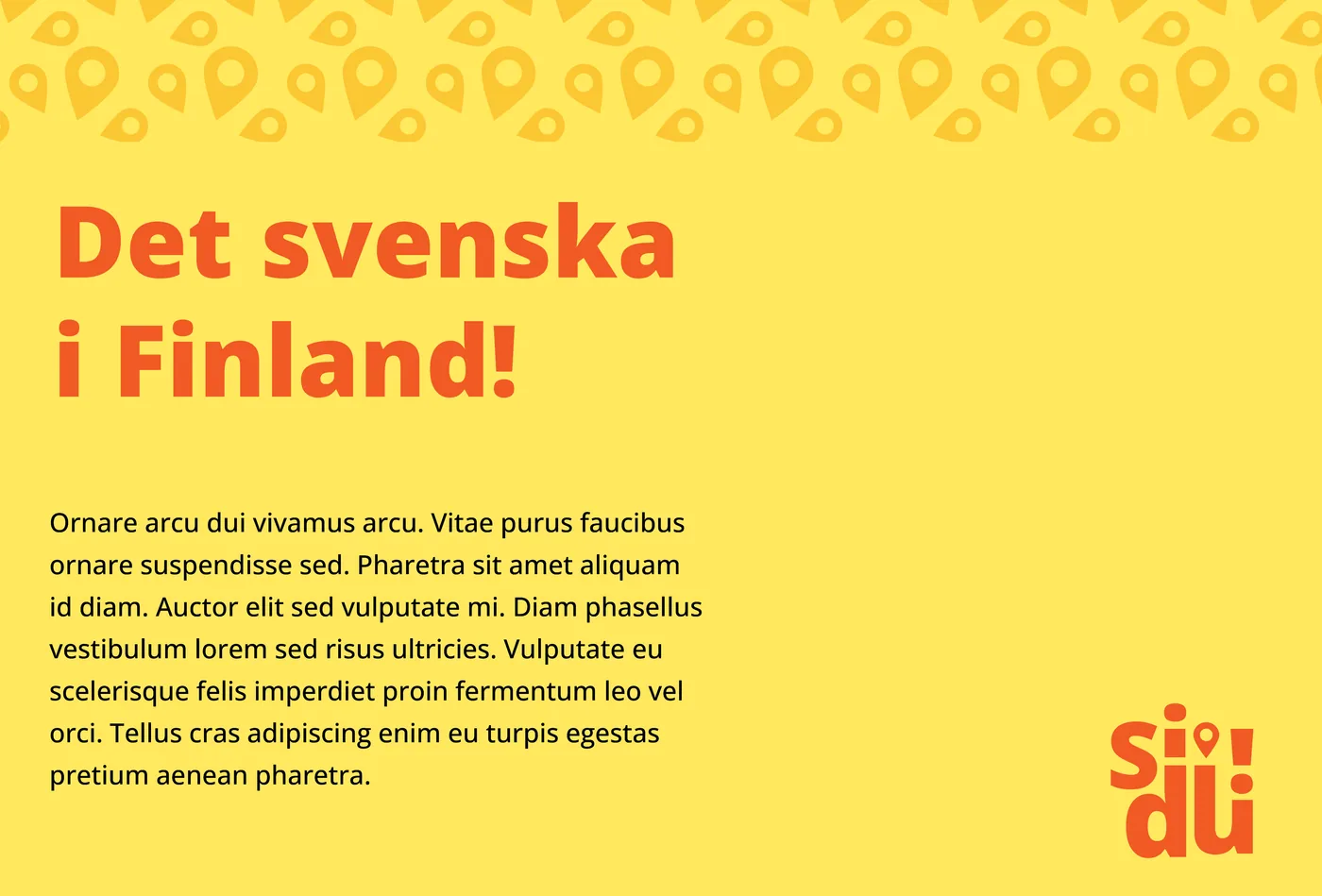
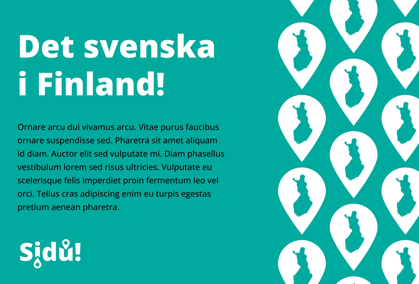
Various sketches of the visual identity and the logo that were presented to the client.
Jenni has been invaluable to our project. Even when we didn’t quite know what we were looking for, she understood our needs and created designs that suited us perfectly. She has always been prompt and communicated clearly. Overall, she has been a super professional and great colleague.
A map pin on both sides of the logo
One logo was, in the client’s view, by far the best. The strongest version had a map pin both above and below the name. Two pins pointing in different directions suggest that the culture is looked at from every side rather than from a single point of view.
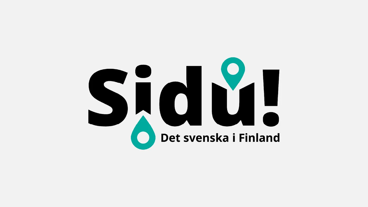
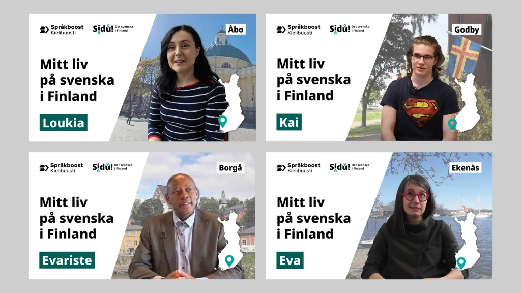
The final logo animated and as a still. The animated logo was used in video material.
A presentation template for the content producers
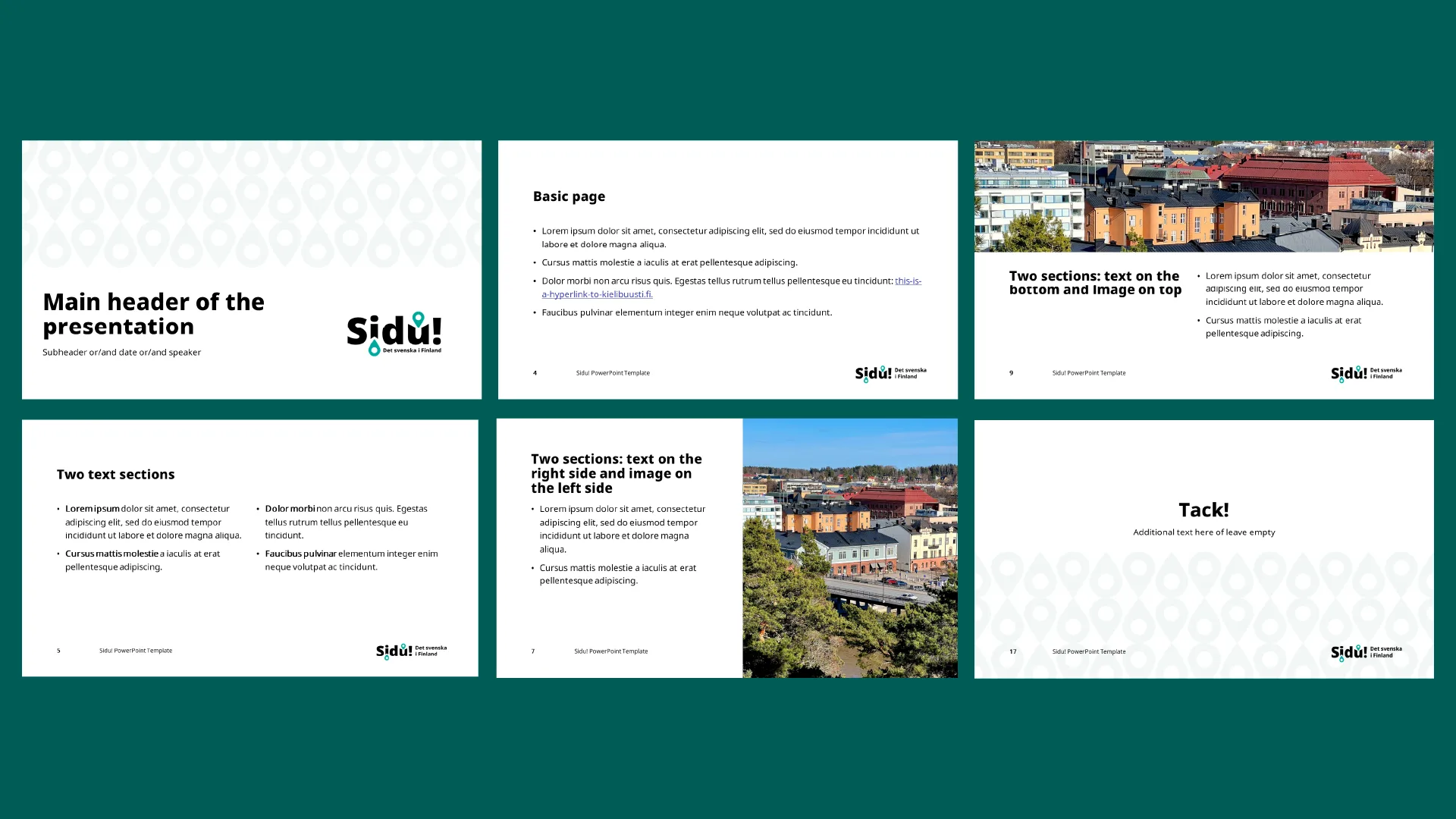
Several people produced content for the course, so a logo alone was not enough. I designed a PowerPoint template that let the content producers build presentations themselves without the result falling apart. The template has ready-made structures for text and images in different combinations.
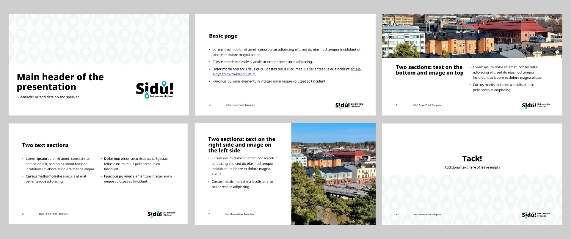
The template’s ready-made structures for text and images in different combinations.
Outcome
The course got an identity that holds together from the logo through the presentation slides to the videos. The content producers were able to make material themselves without a designer being needed for every slide.