Graphic design
University Pathway Finland
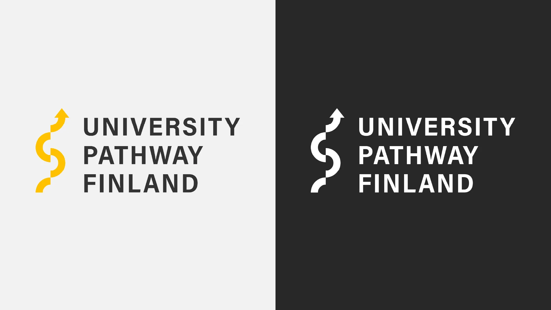
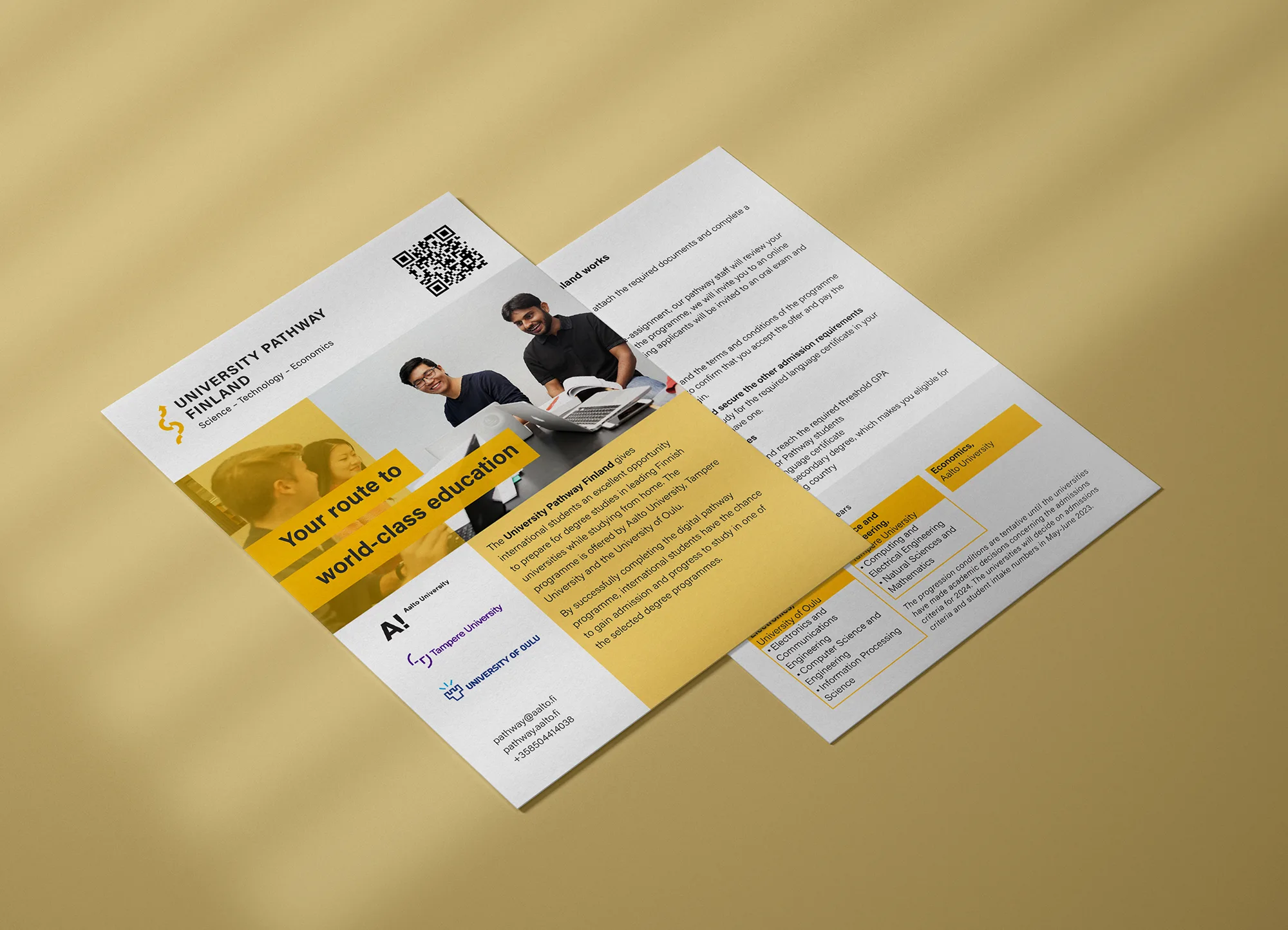
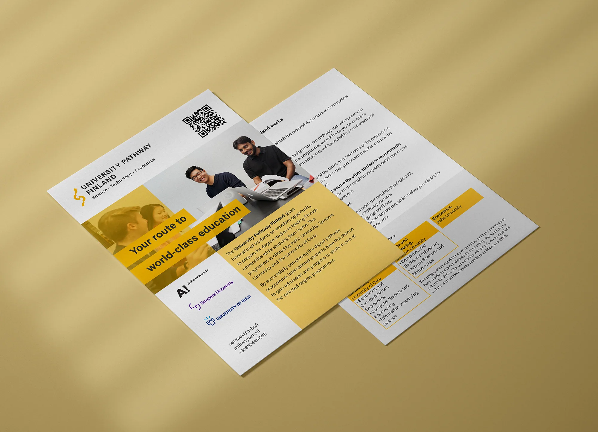
I designed the logo, the visual identity and the printed brochures for a study programme shared by three universities.
Project summary
- Client
- Aalto University, University Pathway Finland
- Year
- 2023
- Type
- Visual identity, print
- Tools
- Adobe Illustrator and InDesign
Background
University Pathway Finland was a joint programme of three universities offering international students a route into Finnish higher education. It needed a visual identity of its own — one that would sit alongside all the participating universities without looking like the material of any single one of them.
Design
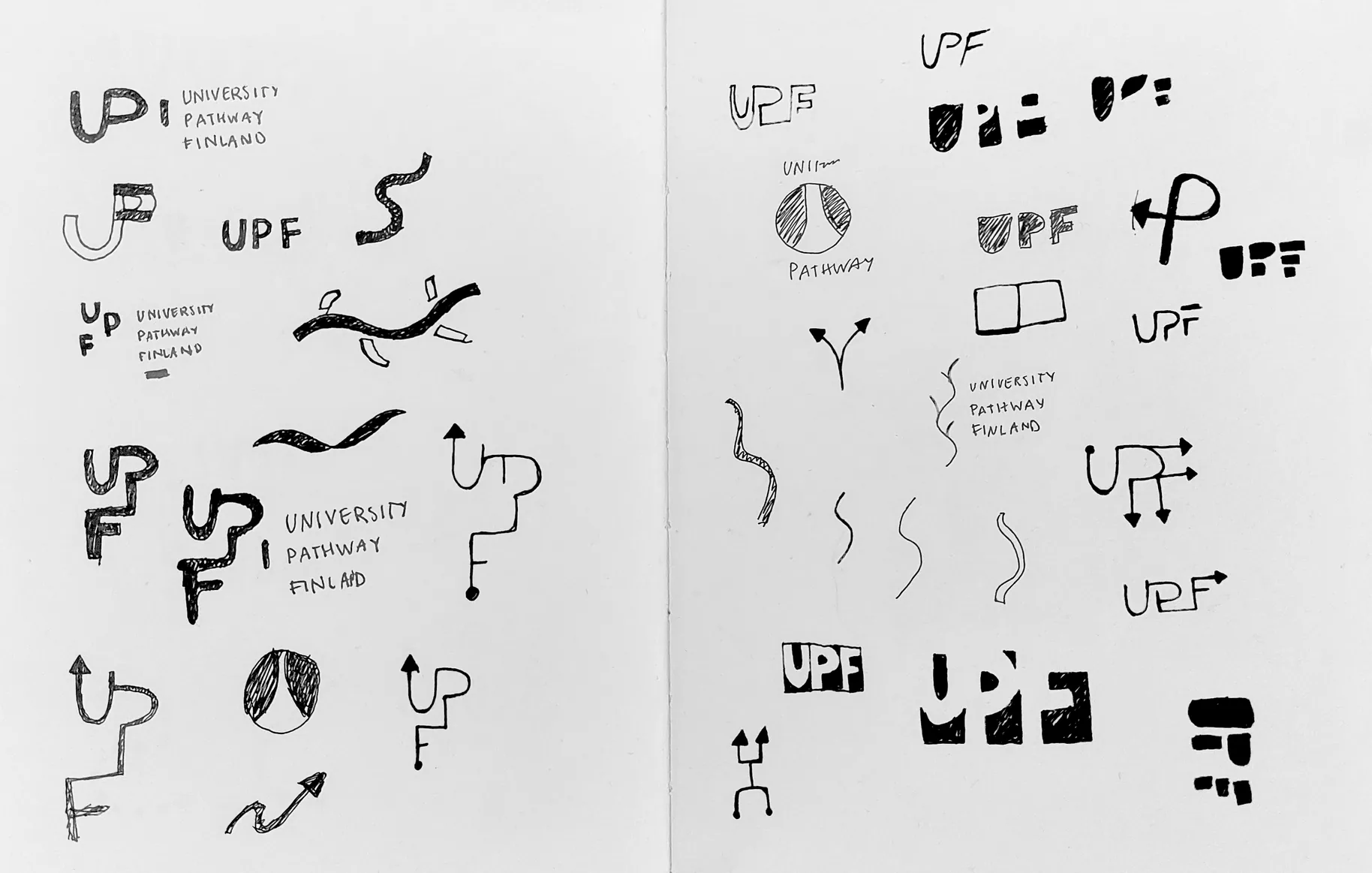
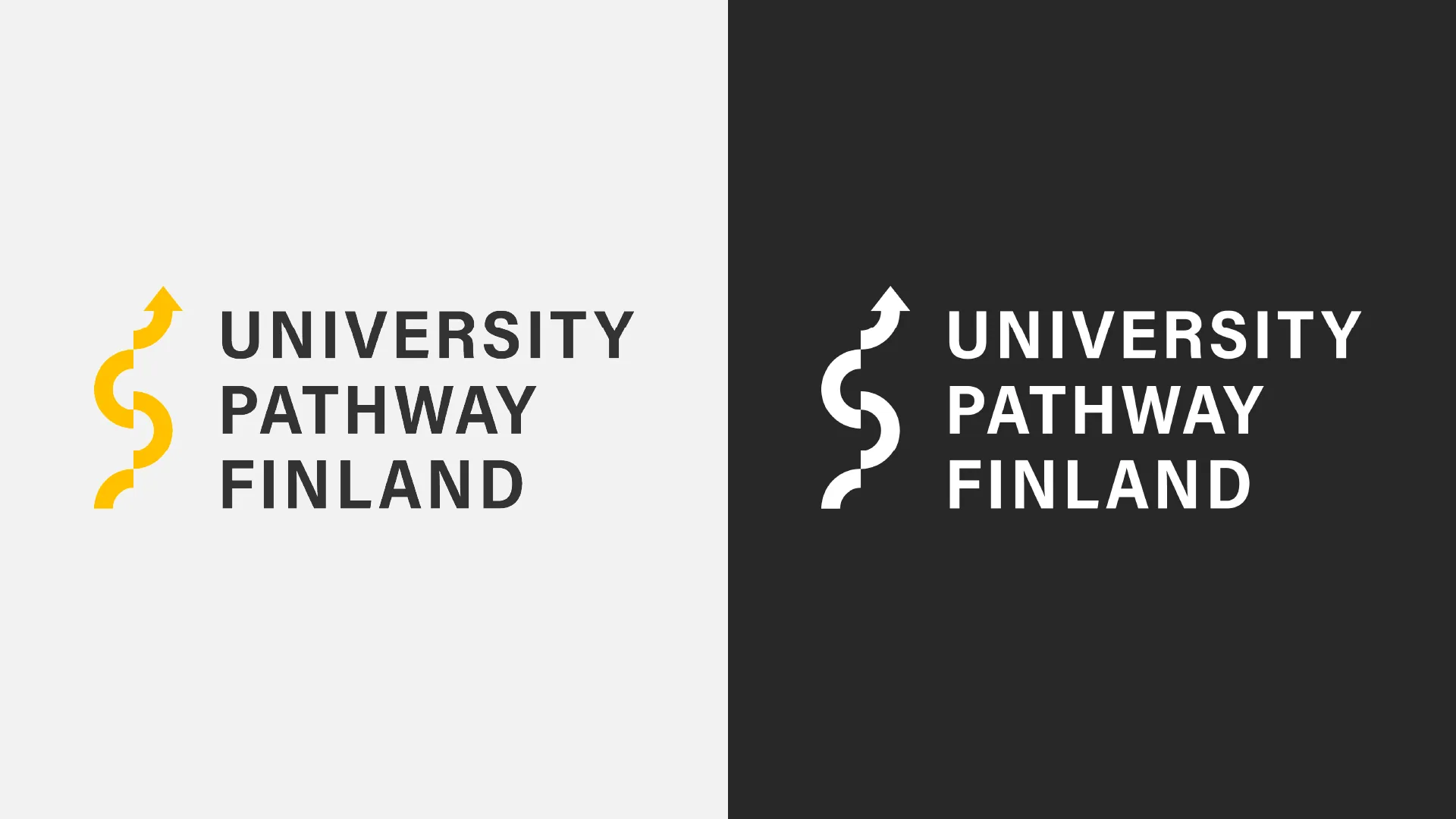
I started by sketching the logo with pen and paper, working through dozens of directions before arriving at a rising path built from separate parts. The parts stand for individual studies that together form the student’s own route. The identity had to look official but not heavy, because the audience was young people who were only just considering studying in Finland.
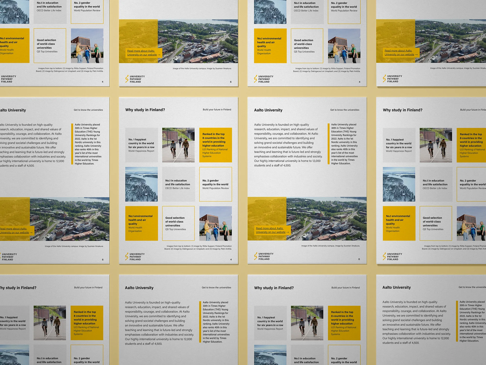
I built it on bright yellow, black and generous white space. The colour set the programme apart from the participating universities’ own identities and kept the materials recognisable as a family.
From the identity I designed the brochures and presentation material. Both had the same challenge: there was a lot of information and the reader skims it quickly. I solved it with clear columns and pull-outs that show the essentials without having to read the whole page.
Outcome
The programme got an identity that worked both in printed brochures and in presentations, and stayed recognisable among the materials of three universities. The logo was produced in both a colour and a single-colour version.