UI/UX design
Wave-R app
I led the UI/UX design and visual identity of a micro-influencer app.
Project summary
- Client
- Wave-R Oy
- Duration
- 9 months (2025–2026)
- My role
- Visual identity and UI/UX design
- Working with
- A developer and a product owner
- Platform
- App and website
- Tools
- Figma and Claude
Background
What is Wave-R?
Wave-R was a startup with five founders and two employees, running in 2025–2026. The company built an app where influencers and consumers create a profile and apply to join brand campaigns. A single campaign can involve several influencers.
My role
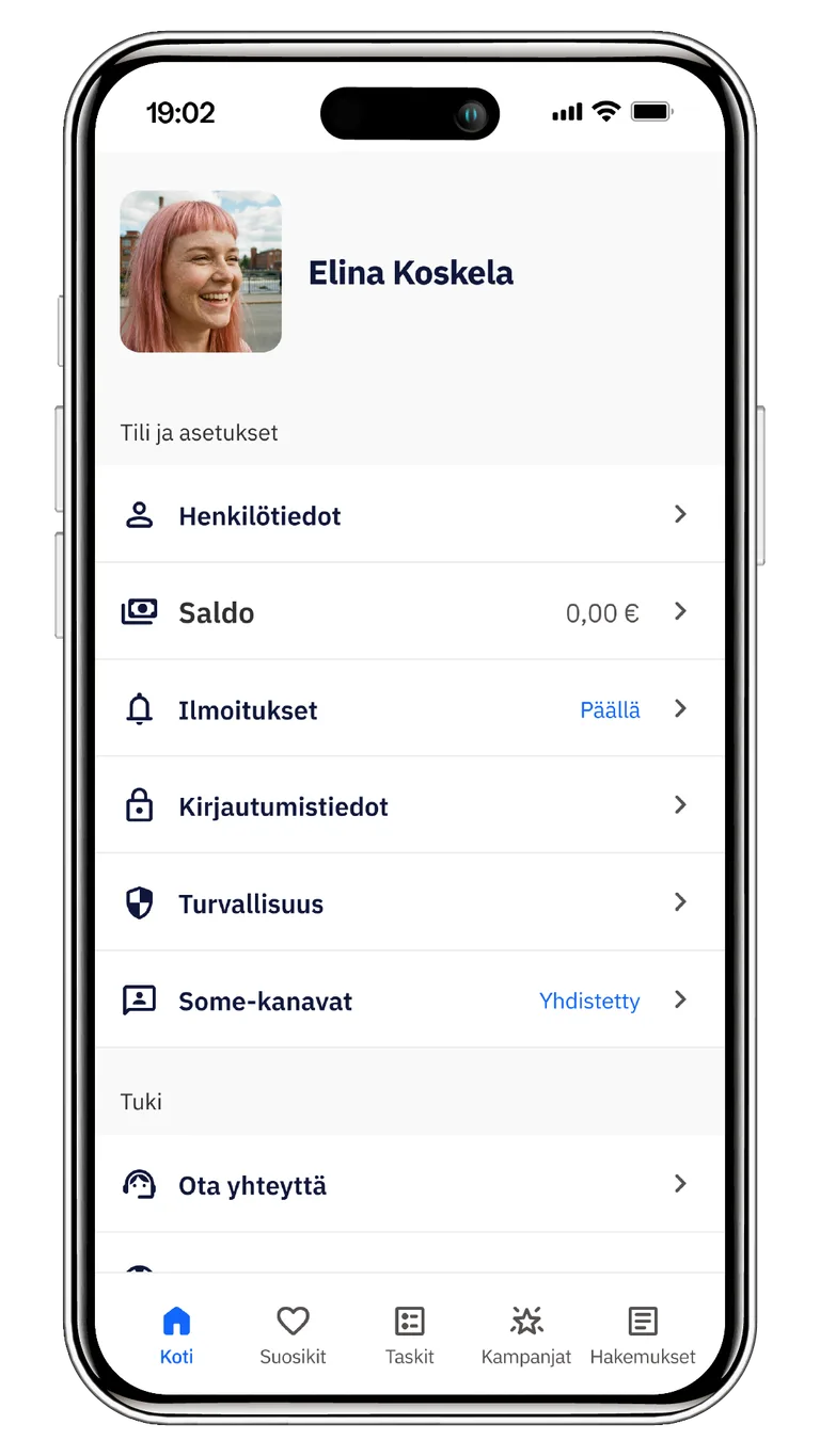
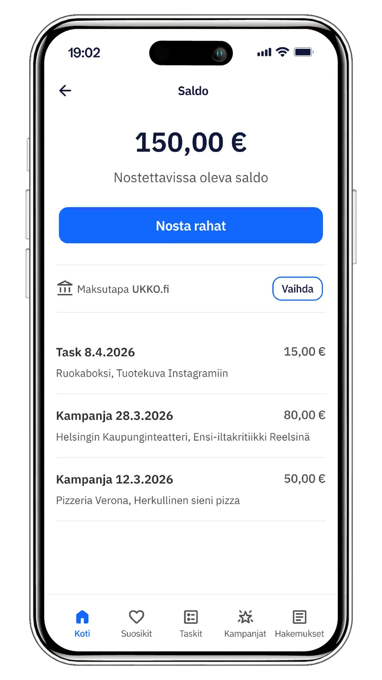
I joined Wave-R in autumn 2025 as the only designer. The concept and a first version of the app already existed, but the visual identity had been left unfinished and there was no scalable design system underneath it. I was responsible for UI/UX design, the design system and finishing the visual identity. I designed both the mobile app and the desktop site, working closely with the developer. Alongside product work I produced the marketing material: animations, print and digital imagery.
Challenges
- Limited time
- Fast startup pace
- A small team
User groups
- Influencers and consumers who want to earn extra income or start a career in social media
- Businesses that want visibility through genuine social media posts
Design
The groundwork was done
By the time I joined, the concept, brand and first version of the app were already in place. A previous designer had created the visual identity and logo and designed the MVP. The founders had also tested the idea in practice by matching businesses and influencers through WhatsApp.
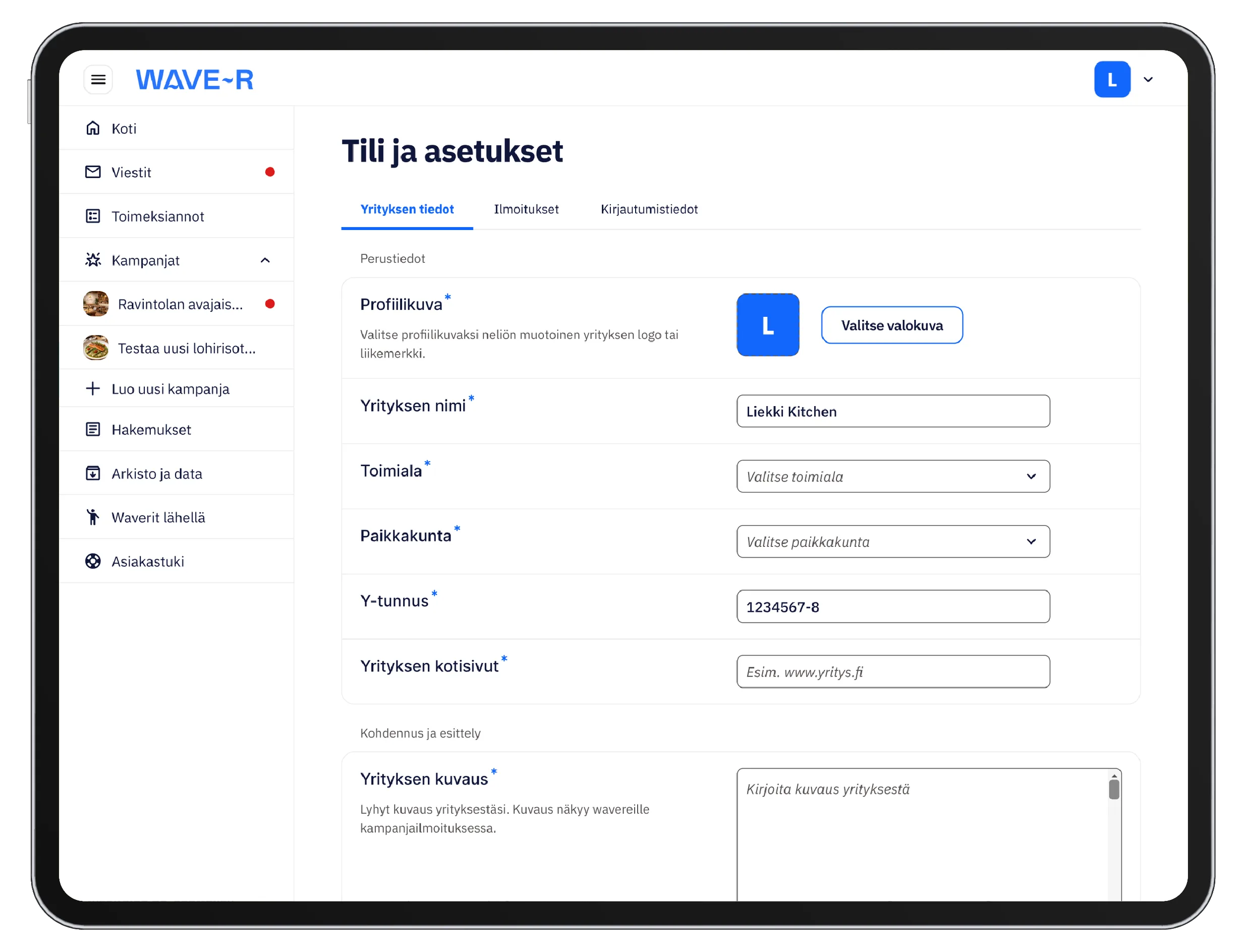
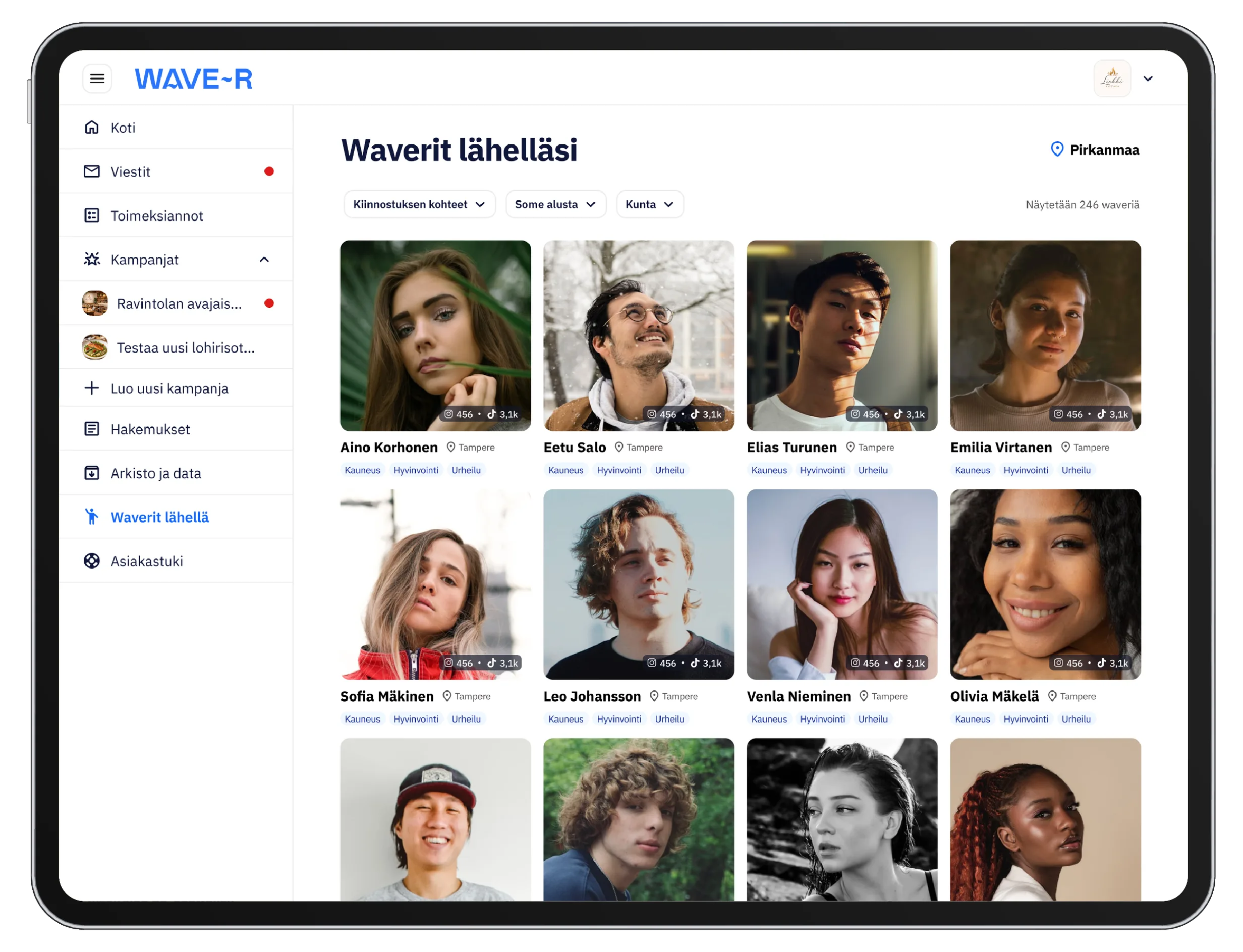
My job was to take the app forward from there. I started with the desktop view, which the app did not yet have.
Building a scalable design system
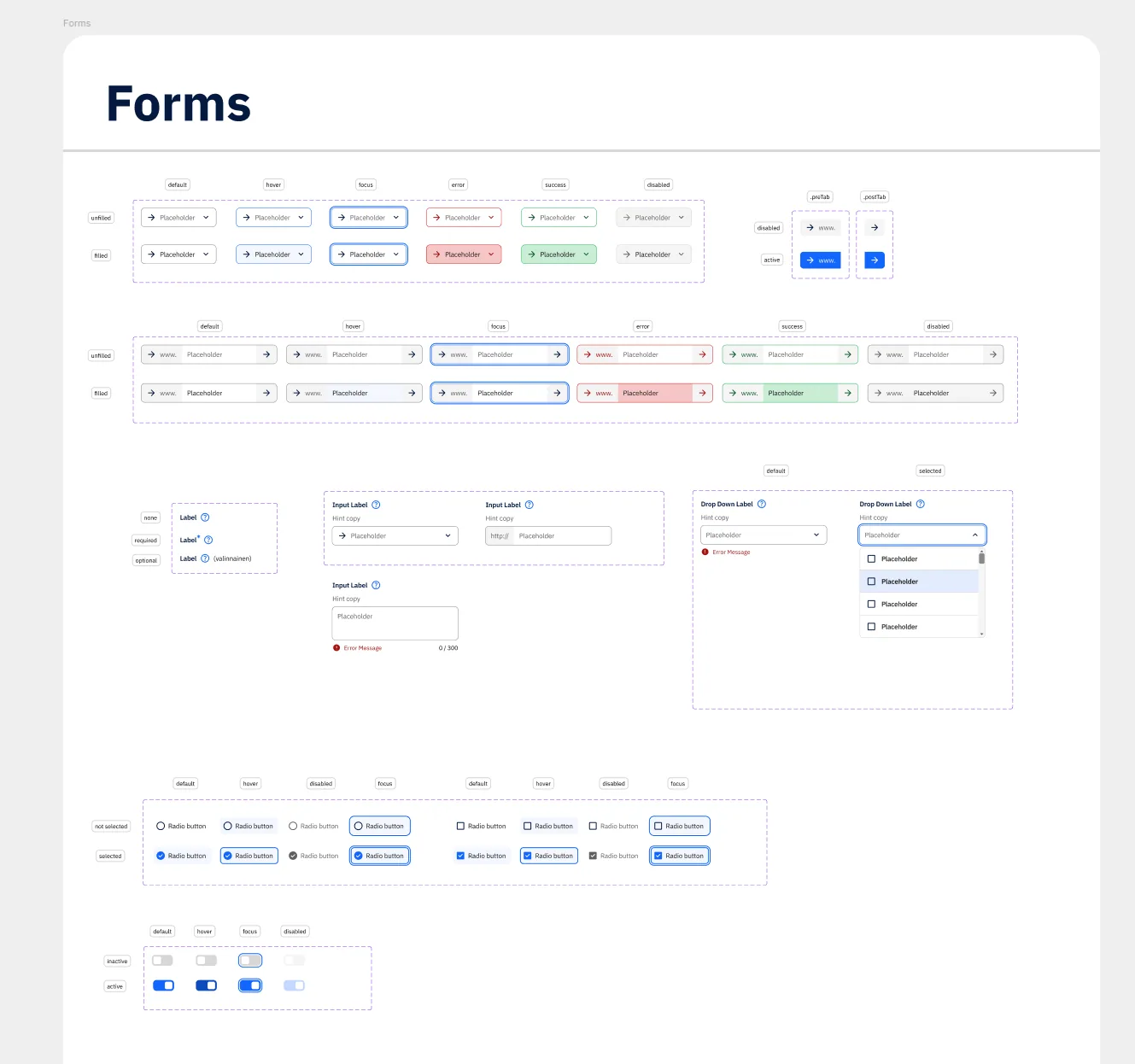
I built an atomic design system from scratch, defining components, colours, typography and effects as tokens. Accessibility went in from the start: I adjusted contrast to meet the WCAG criteria and at the same time strengthened a visual identity that had originally been put together in a hurry.
I used AI automation in the build. For example, I built a Claude Cowork skill that produced correctly shaped, pre-normalised icon files for Figma.
Building the design system took time, but I saw it as essential: it made designing new views considerably faster later on.
Designing with AI
Beyond automating routine work, I used AI as a sparring partner in design, mainly to test interface logic and UX copy.
I found that AI could not yet produce interfaces that earn a user’s trust, so I did the designs myself. I tried out versions in Figma Make, but finished them by hand.
Because the app was being coded with AI help and the pace was fast, I wanted to strengthen the communication between Figma and the AI. I structured the files so the AI could read them as well as possible. That kept design and implementation closer together.
User research
I designed and ran a user survey to find out what would make micro-influencers and consumers use the app more often. Just over 50 users responded.
Respondents were interested in the app and wanted to use it, but were frustrated by technical problems. The survey also confirmed an important design lesson: the interface was not what most affected whether the app got used. It was a reminder to prioritise the right things and to test assumptions with users, rather than trusting how the problem looked from a designer’s point of view.
Working with Jenni was great. The role was not the easiest, but she picked it up quickly and exceeded expectations. What stood out most was her efficiency and precision.
Examples
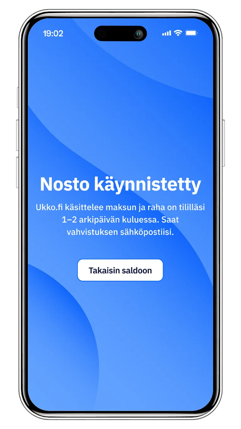
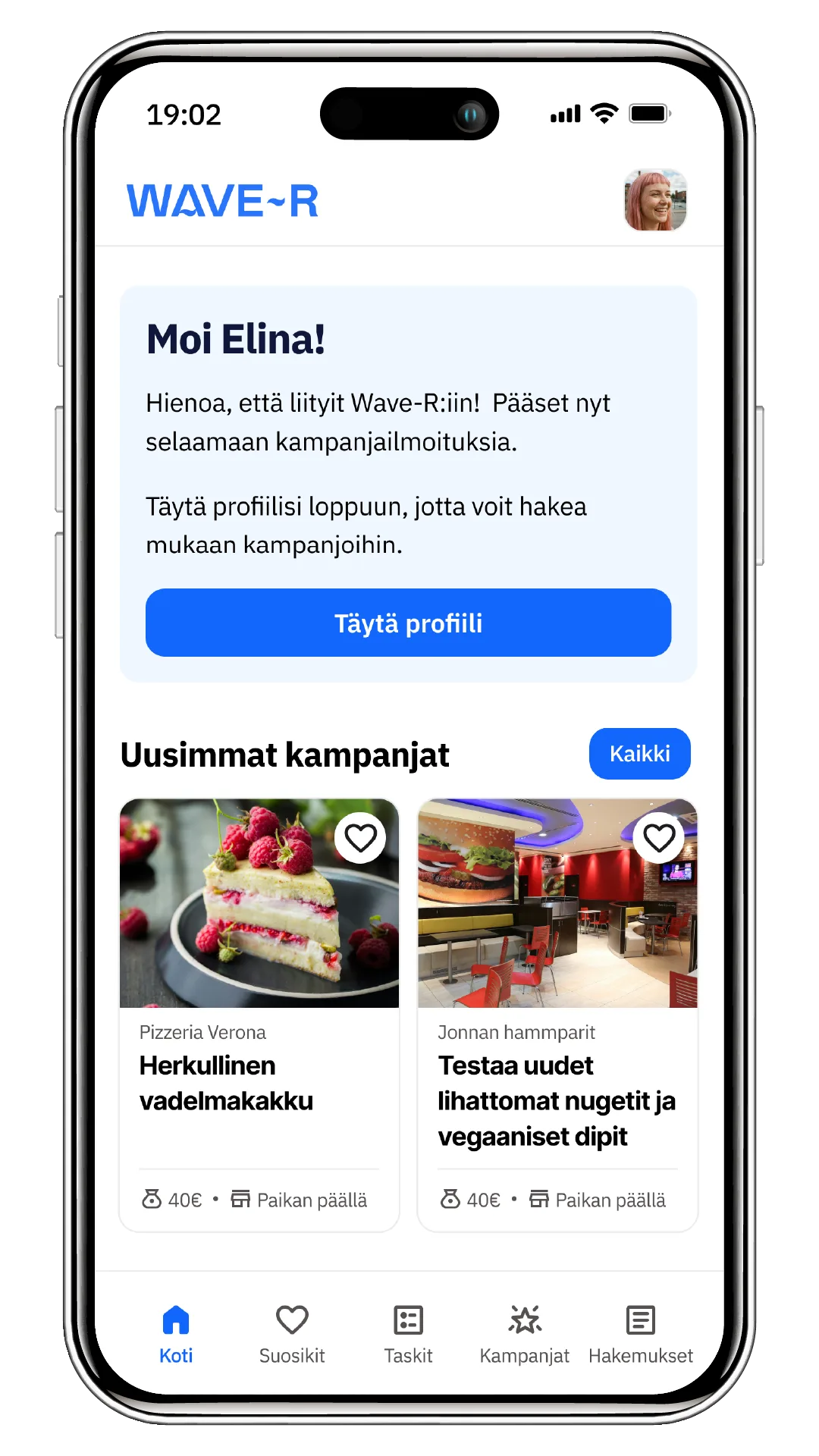
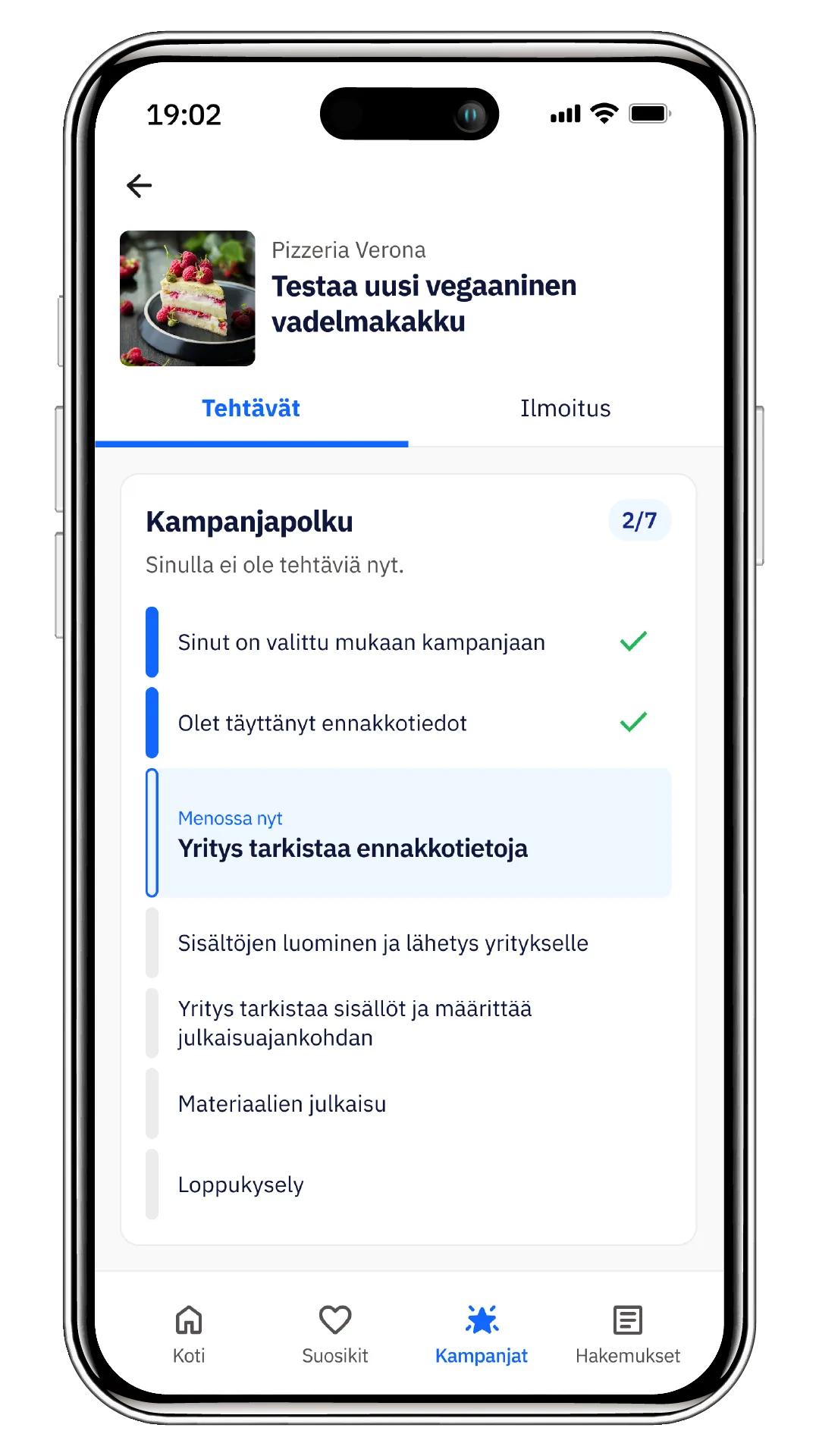
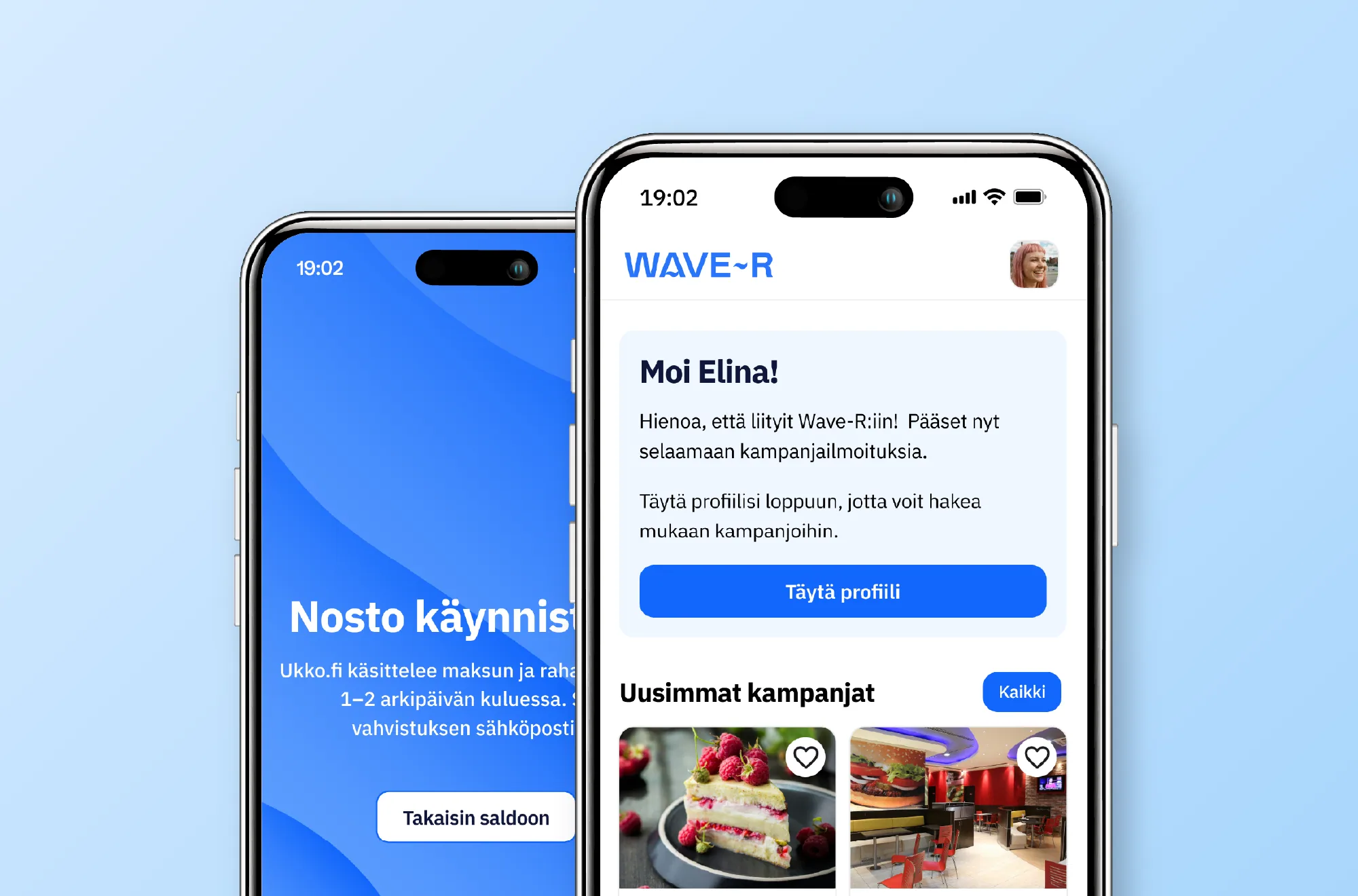
Below are examples of designs I made for the Wave-R app.
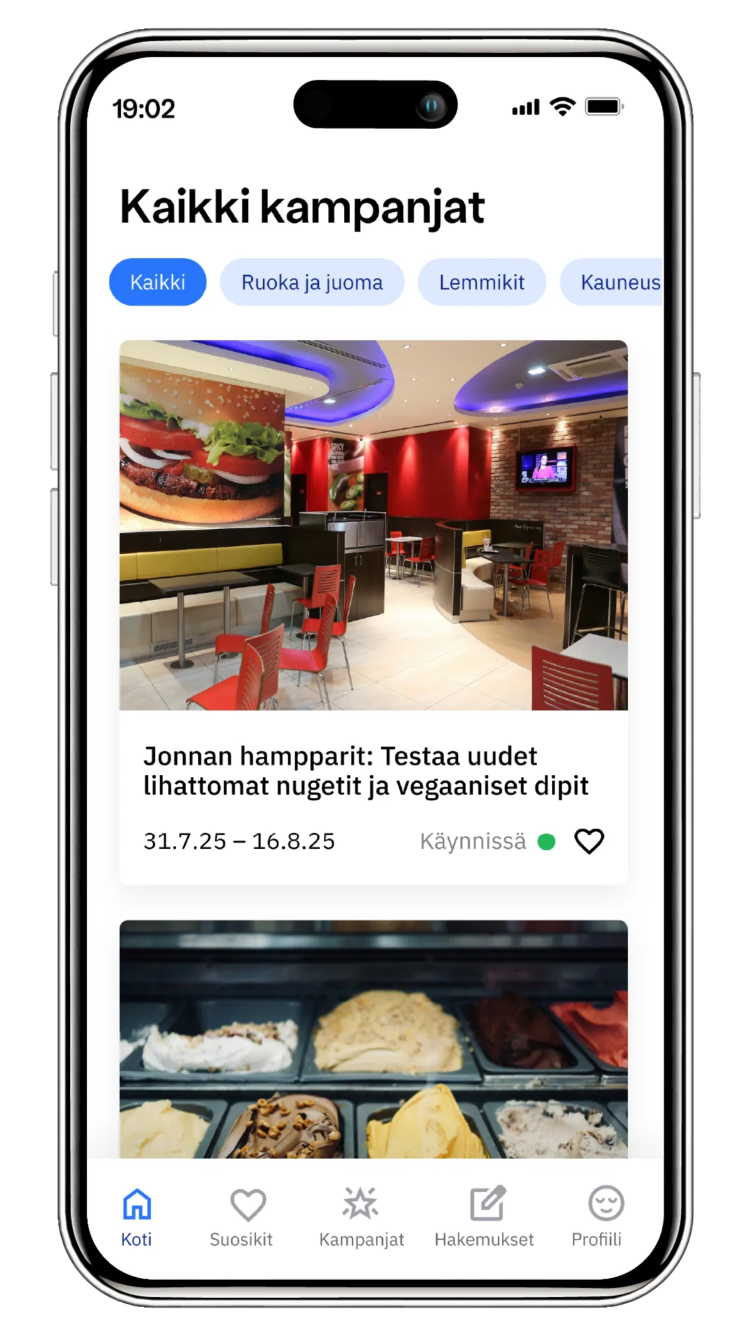
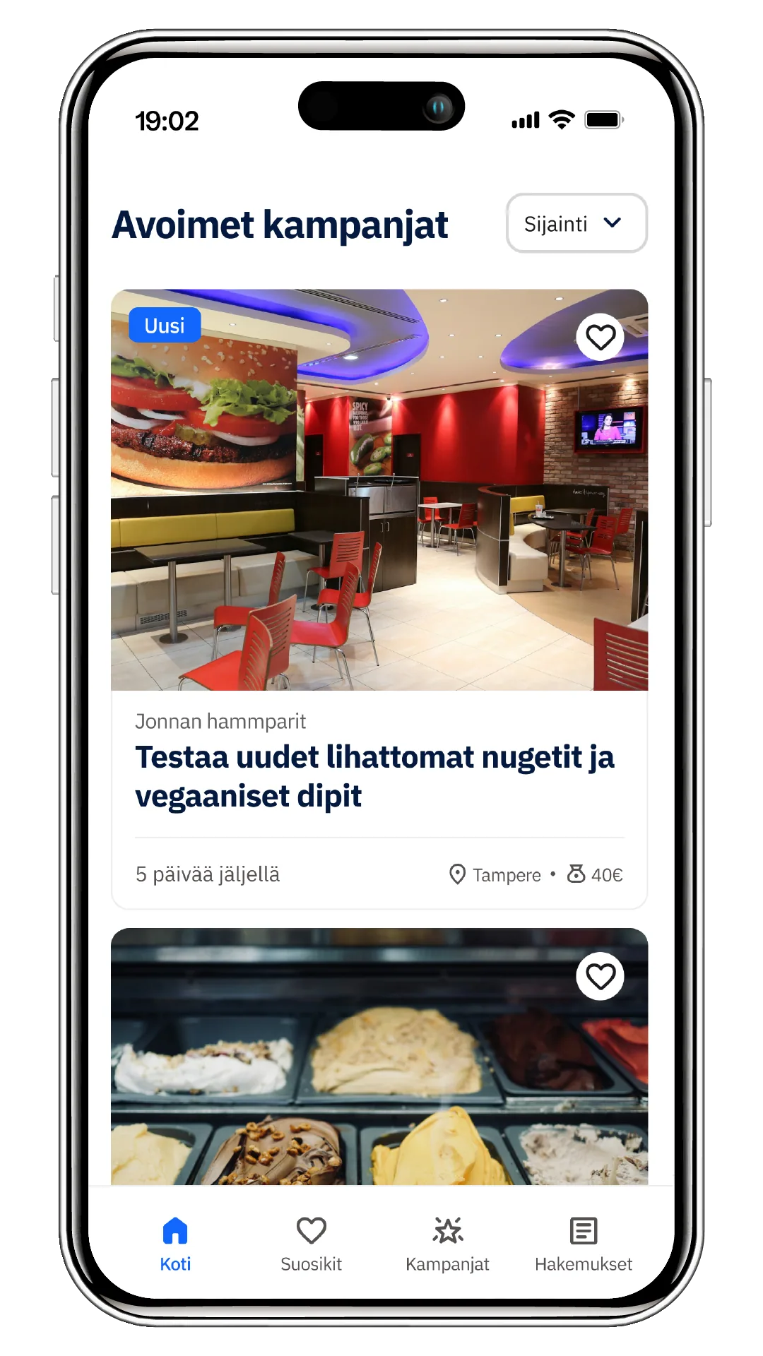
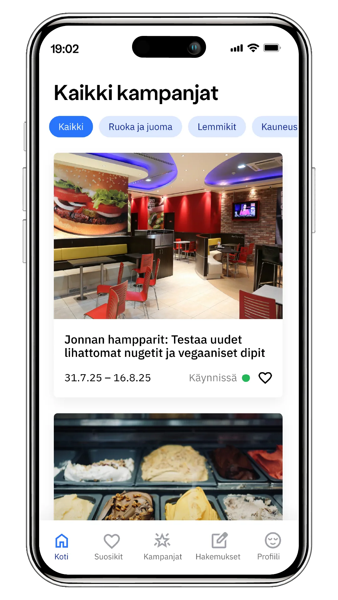
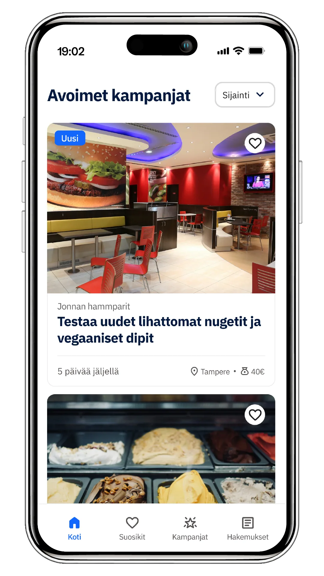
A clearer campaign view
- Location made visible: The research showed that what frustrated influencers most was not finding campaigns in their own area.
- A different filter: The interests filter did not help while there were still few campaigns. At this stage location is the more useful piece of information.
- Fee brought forward: The fee used to take a separate search to find. I moved it onto the card so the value of the offer is visible immediately.
- Time made concrete: Dates do not say clearly enough when a campaign is open. Showing how many days are left is clearer.
Campaign listing
- Key facts under the title: Location, campaign type and time remaining move onto their own line right under the title, so an influencer can decide quickly whether the campaign interests them. A product campaign shows that a product comes on top of the fee.
- Contact details as clear links: The company address and website are now tappable links rather than buried in body text.
- Logo for recognition: I added the company logo so the brand is recognisable at a glance.
Outcome
- A complete atomic design system serving both the mobile app and the web service seamlessly.
- A coherent, recognisable and carefully finished visual identity.
- A code-ready Figma architecture that flows straight into development through an MCP workflow.
- A better user experience and clearer UX copy.