UI/UX design
Kielibuusti web portal
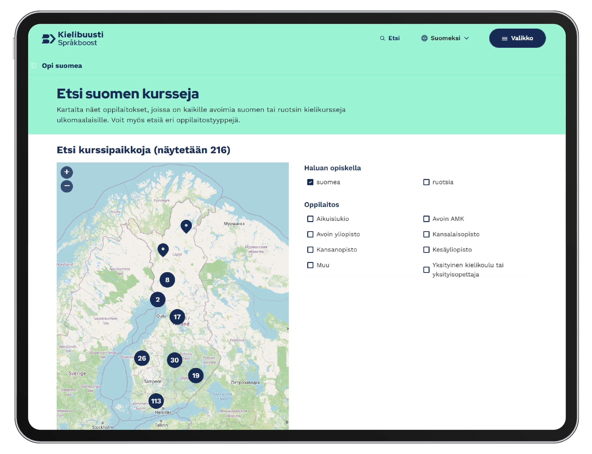
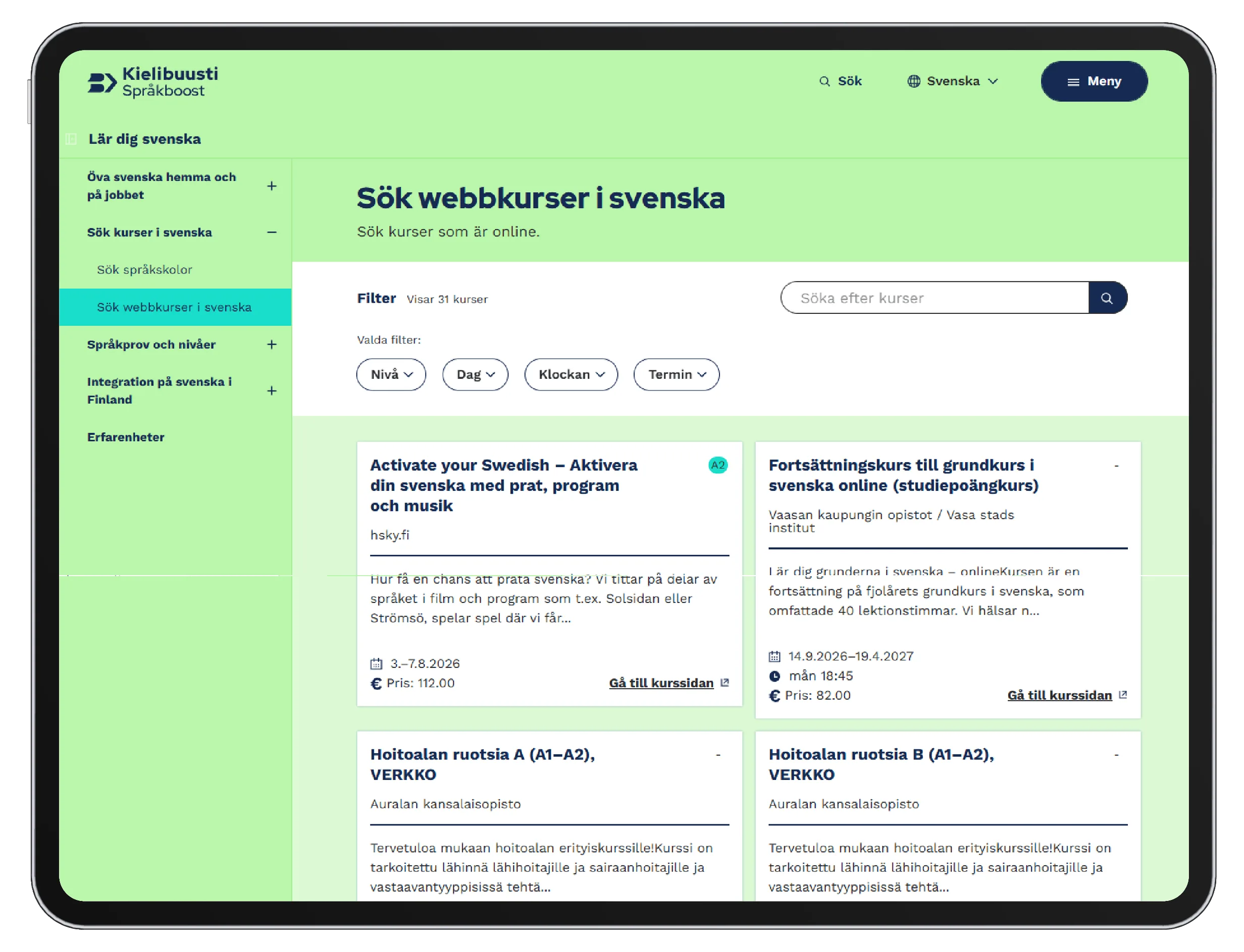
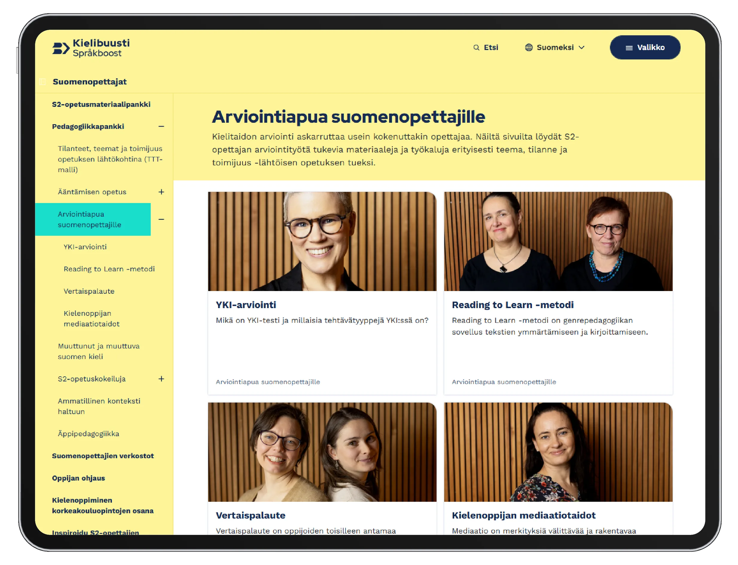
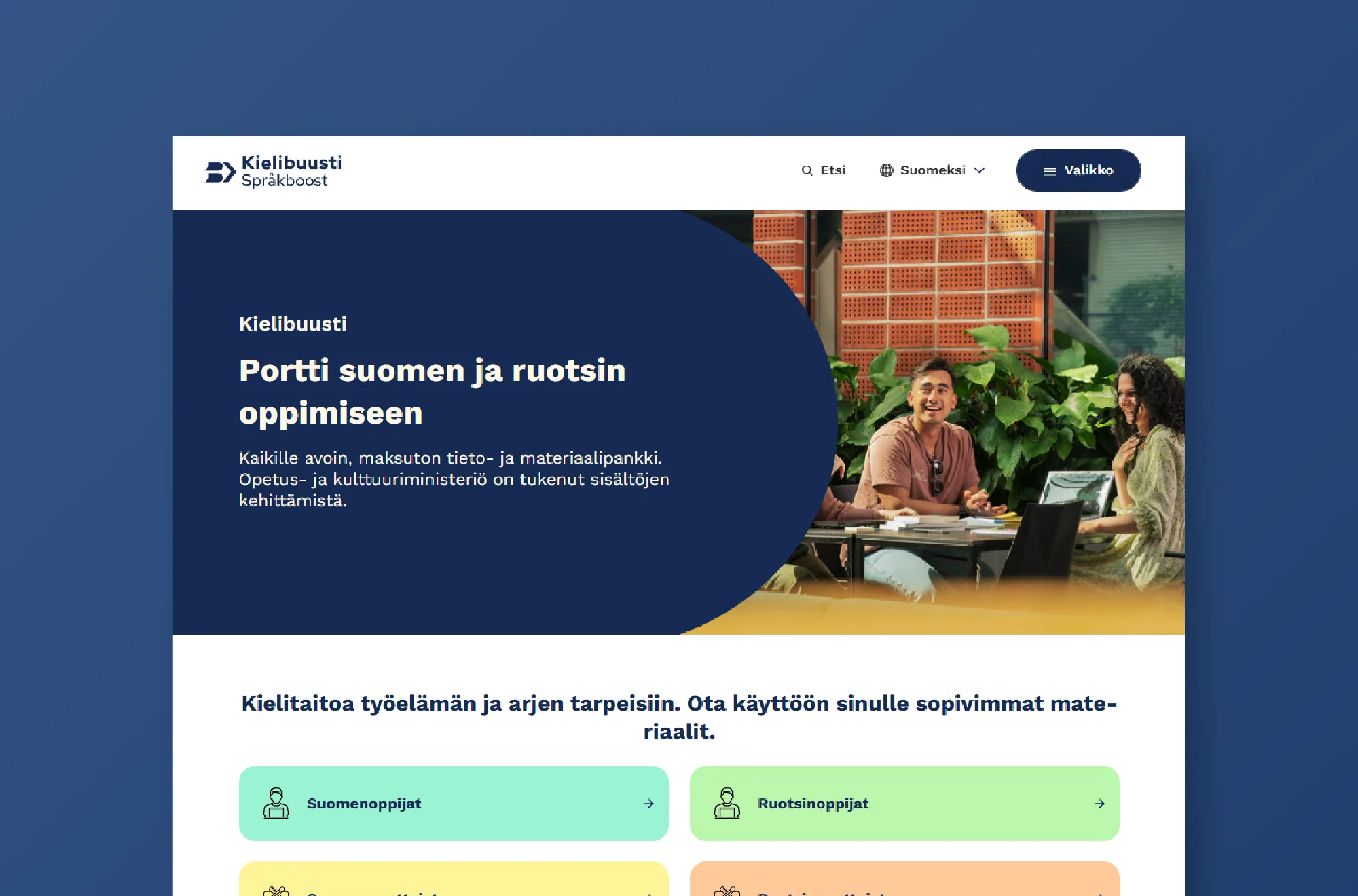
I was responsible for the visual identity of an open language-learning portal and took part in its interface design as a member of the project team.
Project summary
- Client
- The Kielibuusti project
- Duration
- 3 years (2021–2024)
- My role
- Visual identity, graphic design and interface design
- Collaboration
- The Kielibuusti project, Aalto University and Siili Solutions developers
- Platform
- Website, Drupal
- Tools
- Figma
Background
What is the Kielibuusti project?
Kielibuusti is a national project funded by the Finnish Ministry of Education and Culture. It brings the learning, teaching and support of Finnish and Swedish together into one service that is open to everyone.
Five higher education institutions in the Helsinki region took part: Aalto University, the University of Helsinki, Haaga-Helia, Laurea and Metropolia. Aalto was responsible for building the portal, and I worked at Aalto as part of the project team.
My role
I was the only graphic designer on the project for the full three years. On my own, I was responsible for the portal’s visual identity, graphic design and photography direction.
I designed the interface together with a designer from Siili, and I made sure the whole stayed coherent. Siili’s developers built the solutions, and design decisions were checked with me.
Beyond the portal, I handled the project’s other visual communication: print, social media content and marketing materials. This case study focuses on the web portal.
Challenges
- One web portal for four completely different user groups
- Structuring a large and varied set of learning materials into something easy to find your way around
- The component limitations of Aalto University’s Drupal base
User groups
- Learners of Finnish and Swedish
- Teachers of Finnish and Swedish
- Study and career advisors, and higher education institutions
- Workplaces and employers
Design
Design decisions were based on collaboration with experts and on user research
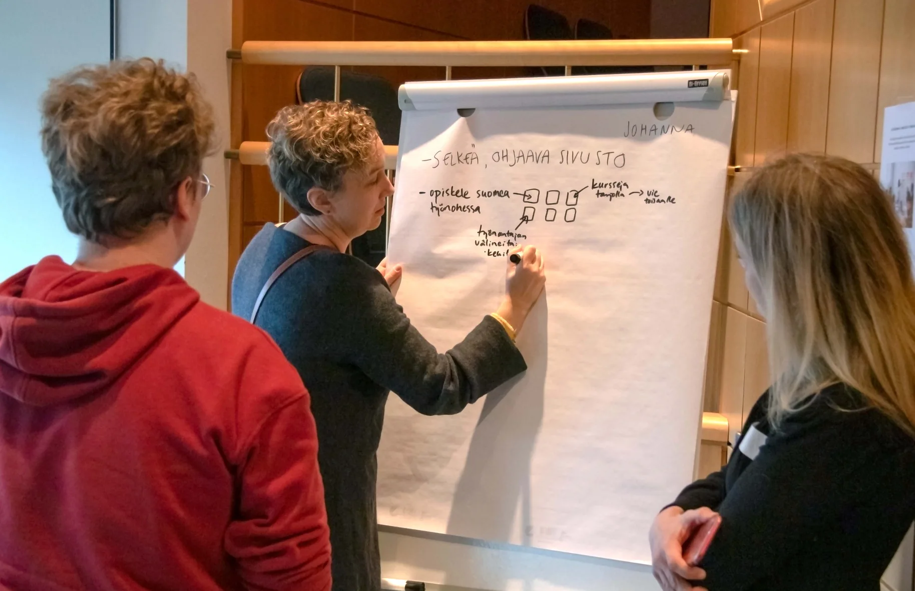
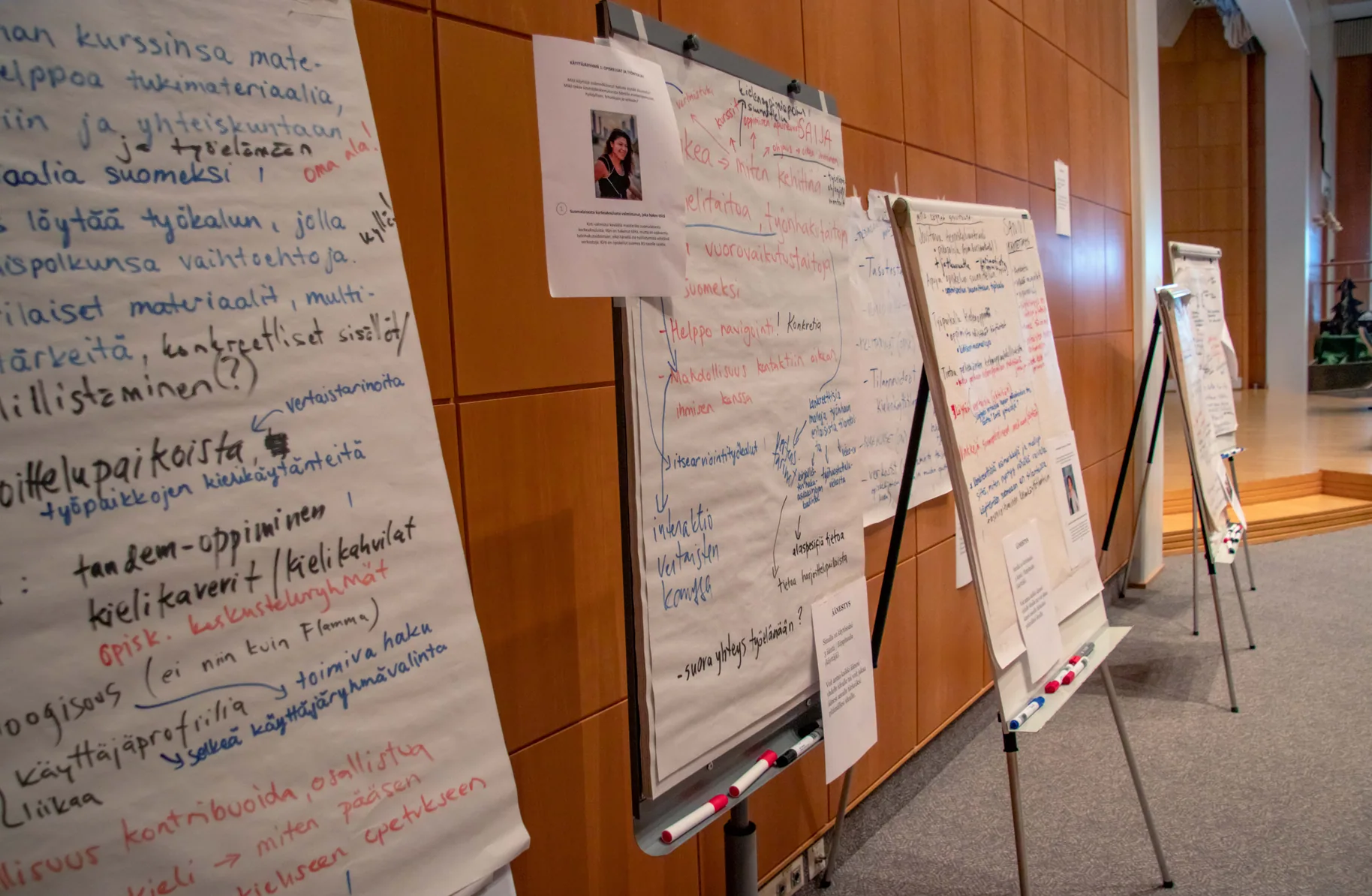
The project ran extensive user research: workshops, surveys and interviews with the different user groups before the portal was built, during the build and after it. The workshops brought together everyone involved in Kielibuusti, and I took part in them as one of the participants.
I did not design or lead the research myself, but I drew on its findings constantly. I turned user feedback into visual identity and interface decisions.
Working with Jenni has been a great experience. She pays attention to detail in design and always responds quickly, allowing us to move through design tasks efficiently. Not only is Jenni quick and flexible when it comes to iterating on design work, she always brings fresh and creative ideas to the team for further review, helping us to tackle design challenges effectively.
Her positive attitude, open-mindedness and proactive nature make her a pleasure to work with and she creates an environment of learning and collaboration. We’ve learned so much from each other while working on the Kielibuusti project, and her ability to adapt and drive us towards our goals has been essential to the success of this project.
Jenni’s contributions – both in the designs she created and the way she engaged with the team – made a huge impact on Kielibuusti project.
Examples
Below are examples of changes made in response to user feedback.
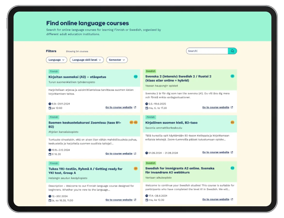
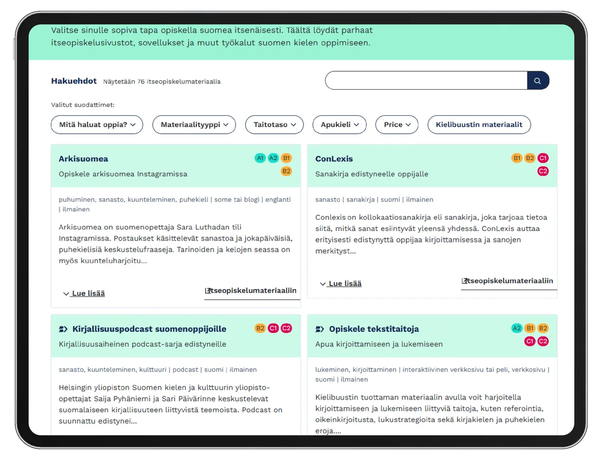
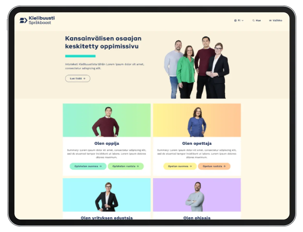
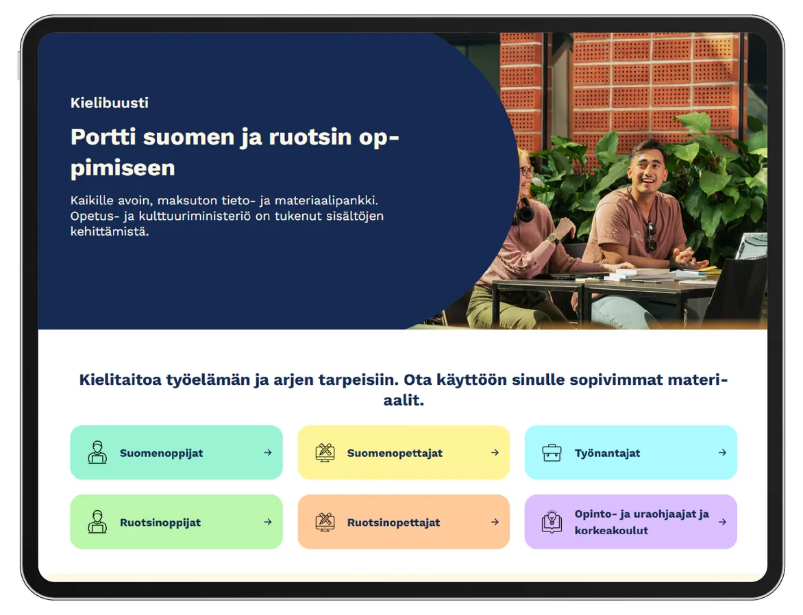
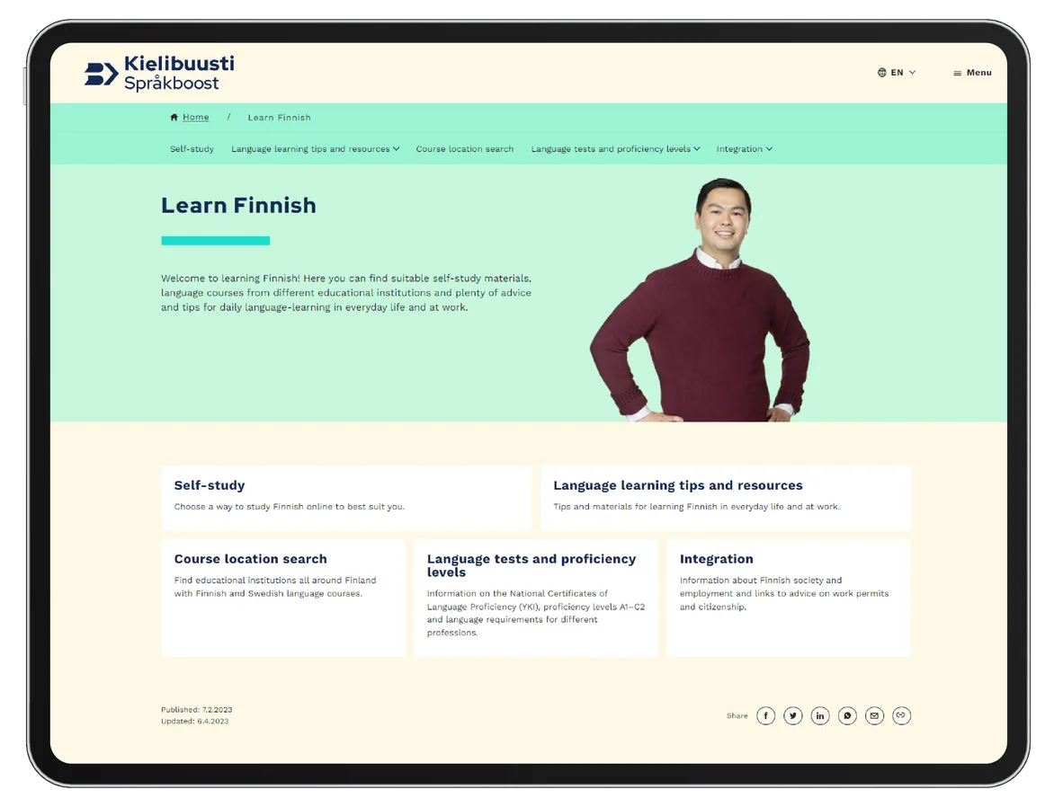
The beige background made the portal feel slow
User interviews revealed that the beige background made the portal feel dated and slow. We changed the background to white, and the portal felt more modern and faster.
The people in the photos were not recognised
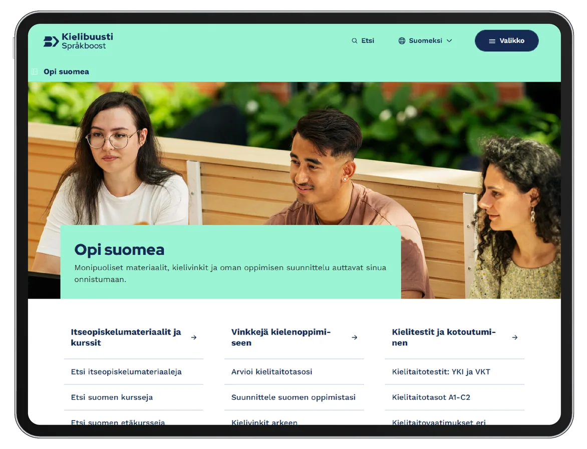
User feedback and interviews showed that people did not understand who the figures on the front page were meant to be. The images felt like stock photography, even though they had been shot specifically for Kielibuusti. I removed the original images and organised and directed a new photo shoot in which people were shown in real learning situations. The new images made the content more relatable and more trustworthy.
Outcome
The outcome was a clear, guiding web portal that serves four user groups in three languages through one coherent interface. The visual identity scales from print to mobile within the limits of Aalto University’s Drupal base. Accessibility was built in from the start: contrasts, typography and multilingual logic follow the WCAG criteria.