Graphic design
Kahvihuonevihko
I laid out and illustrated a printed notebook that helps someone learning Finnish and their colleague talk to each other over a coffee break.
Project summary
- Client
- The University of Helsinki, the Kielibuusti project
- Year
- 2023
- Type
- Visual identity, print
- Tools
- Adobe Illustrator and InDesign
Background
The workplace break room is one of the few places where someone learning Finnish can use the language without a high barrier. The situation is awkward for both sides, though: the learner does not know what to say, and the colleague does not know how to help. The notebook was made to ease exactly that.
Design
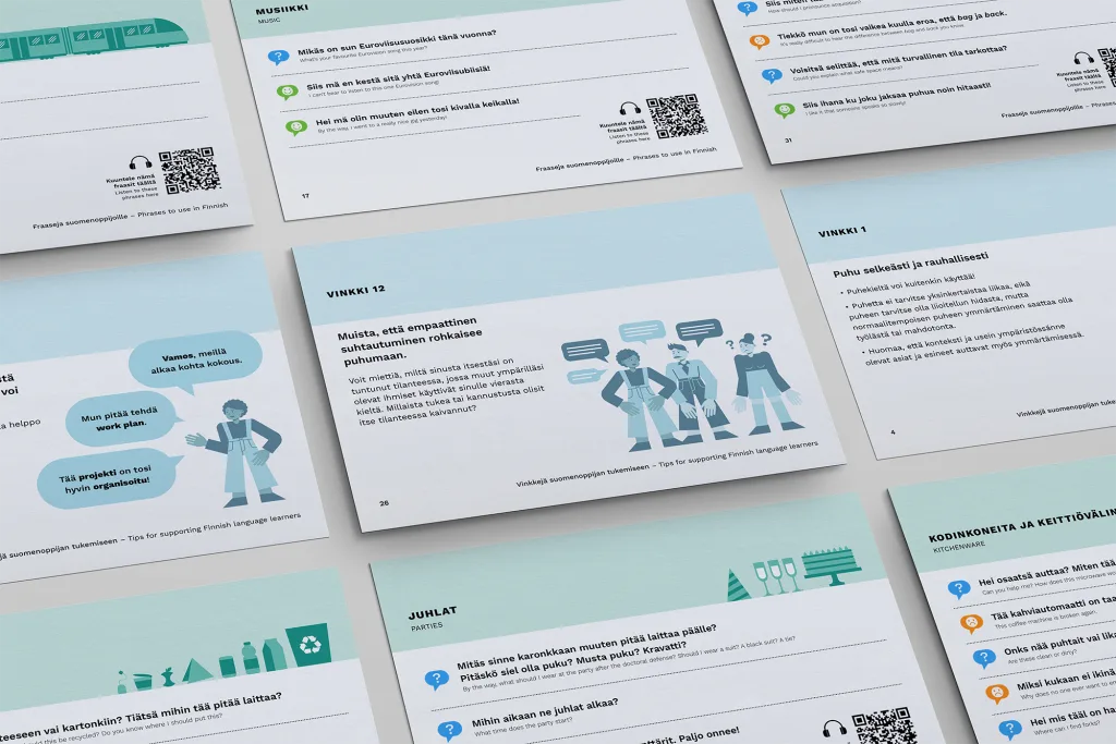
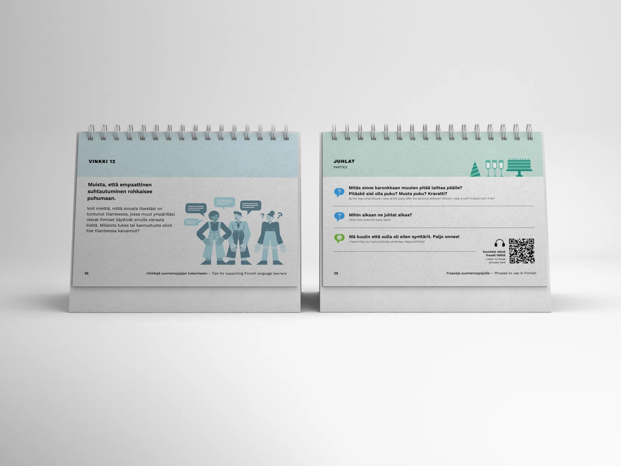
There were two user groups with completely different needs. I solved it with a double-sided structure: one side is for the person learning Finnish, the other for the colleague supporting them. The learner’s side has everyday phrases, such as how to ask about using the microwave. The supporter’s side has practical guidance — for example that it helps to speak clearly, but not too slowly.
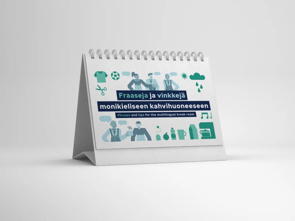
The notebook is built like a desk calendar, so both sides are open at the same time. Two people can read it together without either one having to wait their turn.
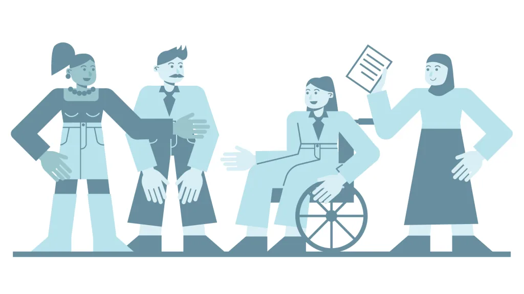
I drew the illustrations myself. On the learner’s side the images show objects from the break room, on the supporter’s side people in conversation. I built the characters modularly, so that bodies, hair, clothes and poses are interchangeable parts. That let me produce a large number of different characters quickly while keeping them consistent with one another.
It mattered that the characters showed people from many backgrounds. Someone learning Finnish does not always look European, and a native speaker does not always either. The illustrations break that assumption on purpose.
Outcome
The notebook works as a tool between two people rather than as learning material alone. The illustration system made a wide range of characters possible without having to draw each one from scratch.